Month view Redesign
![]() True to their tradition on the Mac, the Calendar and Addressbook applications on the iPhone are, let's say "lacking finesse". As good as Apple can design products and user interfaces, their focus is clearly not on calendars and address books. I've read somewhere that "iCal is proof that Steve does not maintain his own calendar".
True to their tradition on the Mac, the Calendar and Addressbook applications on the iPhone are, let's say "lacking finesse". As good as Apple can design products and user interfaces, their focus is clearly not on calendars and address books. I've read somewhere that "iCal is proof that Steve does not maintain his own calendar".
After trying out various replacements on the iPhone, I finally stuck with a pretty darn good calendar for the iPhone called "Week Calendar". The main reason for switching to that app is that it actually has a week view, but when I started using it more intensely I found myself using the month view the most. Until somebody at Apple stopped the show.
First of all, let me explain why I like Week Calendar's original month view by comparing it to the original iCal (these are actual screenshots from my actual phone):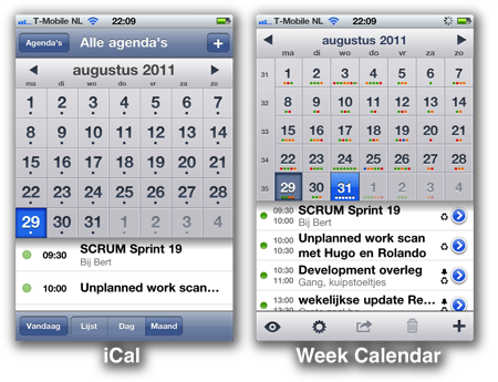
On the left, we see Apple's iCal. Apple places a dot on a day where I have appointments. This not very useful for people who have appointments on each day, as you can see. On the right, Week Calendar's colored dots tells me how many appointments I have, and in which Calendar they are (my green calendar is work, my red calendar is private).
Other big improvements in Week Calendar's month view are more room for the events of the selected day, the week numbers on the left, the end times of appointments, and the little icons indicating recurring appointments and alarm settings. All huge usability improvements, clearly outperforming Apple's iCal. But suddenly the month view disappeared from Week Calendar. Many users of Week Calendar complained, and the response from UtiliTap was rather surprising:
"Apple forced those changes upon us, since they have full control over your iPhone and over developers apps. They claim the Day and (old) Month views look to similar to theirs."
Clearly, somebody at Apple had misinterpreted the rules, and broke a very useful application by using "the force" for no good reason. UtiliTap quickly came out with a release with no less than two month views, the Mini-Month view (which I don't like that much) and a replacement for the original month view.
The replacement month view is not as nice as the first one, and I find that it puts more strain on my eyes when I'm using it. I miss the old month view. I had a whole blogpost ready with a rant about how Apple would now have to sue each Calendar maker in the world because their month view looks too much like Apple's month. But I think nobody at Apple is really going to pay much attention to my little rants on this little blog, certainly not now people are grieving over Steve.
So I decided to think different:

On the left you see the redesigned month view by UtiliTap after Apple bullied them. It's really amazing how quick they were in redesigning this part of the app and releasing it to the app store. But it's clearly a rush job. It doesn't look as polished as the first version, and I think it needs a redesign.
On the right you can see my feeble attempt at a redesign. Apart from the obvious cosmetic changes, there is one feature I added: The dots in the top row of a day are before noon, and the dots in the bottom row are after noon. So now you can not only see how many appointments you have and in which calendar they are, but you can also quickly glance over your month to see if you have a free afternoon or morning. Clever, no?
I sent the design to UtiliTap before writing this blog post, and I really hope they use (some parts) of it. I've told them they can use any part of this design free of charge. Because they provided us with an excellent app for an excellent price, and they didn't deserve to be treated by Apple like this.
I'm looking forward to the next release of Week Calendar.